Wimbledon
Organizing a Grand Slam means solving big logistical puzzles. Hundreds of players and their teams share the same infrastructure, so the schedule has to be both precise and flexible.
Scope of Work
A thoughtful application design process
↓ Research
Market analysis, problem identification, goal definition, forecasting, competition analysis, user surveys, persona creation, empathy mapping
↓ UX Design
User journeys, information architecture, flow maps, functional wireframes
↓ UI Design
Color palette, typography, brand style, interface components
↓ Project Review
Key elements, aesthetics, functionality
↓ Testing
A/B testing, high-fidelity prototypes, final conclusions
The Problem
Organizing tennis tournaments involves a high level of dynamism. Matches run long, weather disrupts plans, and players along with their teams make adjustments almost at the last minute. Existing scheduling tools have struggled to keep up with this pace. They were inflexible, slow, and hard to read. As a result, scheduling conflicts, court availability issues, communication breakdowns, and growing frustration among event participants became common.
A solution was needed that:
- provides a quick overview of court occupancy and the current schedule
- allows efficient response to changes and conflict management
- works both online and offline
- is flexible, intuitive, and easy to read for everyone involved in the planning process
My role
In this project, I served as the UX designer responsible for analyzing user needs, creating an intuitive information architecture, and designing interface prototypes. I worked closely with developers, the product owner, and tournament staff to ensure the solution met real-world needs. I moderated usability tests and gathered feedback from future users, which enabled iterative improvements to the product and adaptation to working under time pressure.
Key responsibilities
- user needs analysis (bookers, coaches, organizers)
- UX design of grids and detailed views
- interaction prototyping (drag and drop, approve booking)
- collaboration with the development team
- usability testing
Predictions:
- 50% fewer booking conflicts through automated detection
- 35% faster schedule management with digital systems
- 95% of coaches and players will expect instant booking visibility and communication
- 80% of systems will be scalable from small tournaments to Grand Slam events
- 70% of solutions will offer offline modes for network disruptions
- 85% of organizational decisions will be supported mainly by visual indicators (colors, grids)
Design process
I began the project with qualitative research among tournament staff to understand their challenges and daily tasks. We analyzed existing booking procedures and identified common problem areas, such as the unclear schedule. Based on these insights, I created wireframes which we tested in simulated conditions. This allowed us to quickly implement improvements grounded in real-life scenarios. The process included:
Research
- shadowing organizers in the tournament office
- analysis of use cases (e.g. quickly moving a player to another court)
- journey mapping for bookers and coaches
Prototyping
- hourly and daily grid views
- reservation type indicators (singles/doubles)
- prototypes of conflict and notification behaviors
Validation
- clickable prototype testing (Figma)
- emergency scenario simulations (last-minute player relocation)
- workshops with the umpire team
Solution
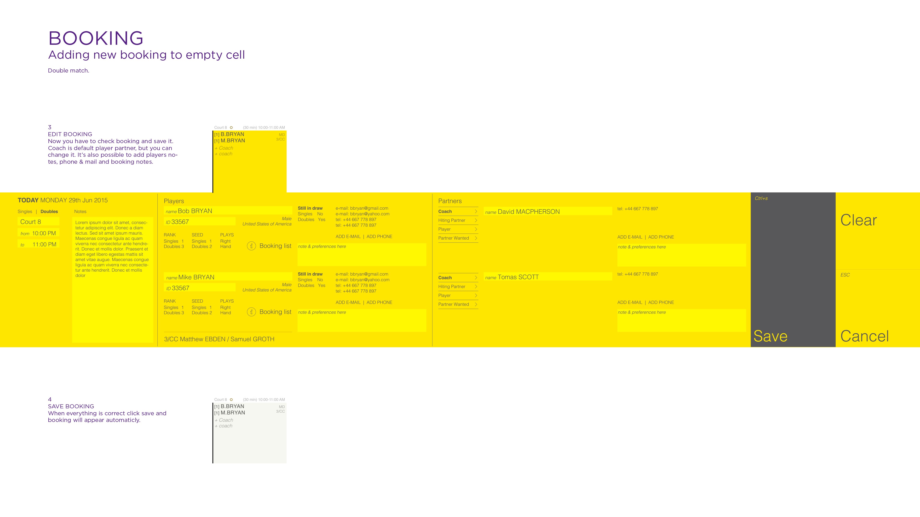
The final solution was based on a modular hourly grid view that enabled efficient real-time court management. The system allowed filtering bookings by game type and approval status, and made conflict detection easier through color-coded indicators. A full-screen mode improved comfort during peak scheduling times, while drag-and-drop functionality and notifications further supported effective schedule control.
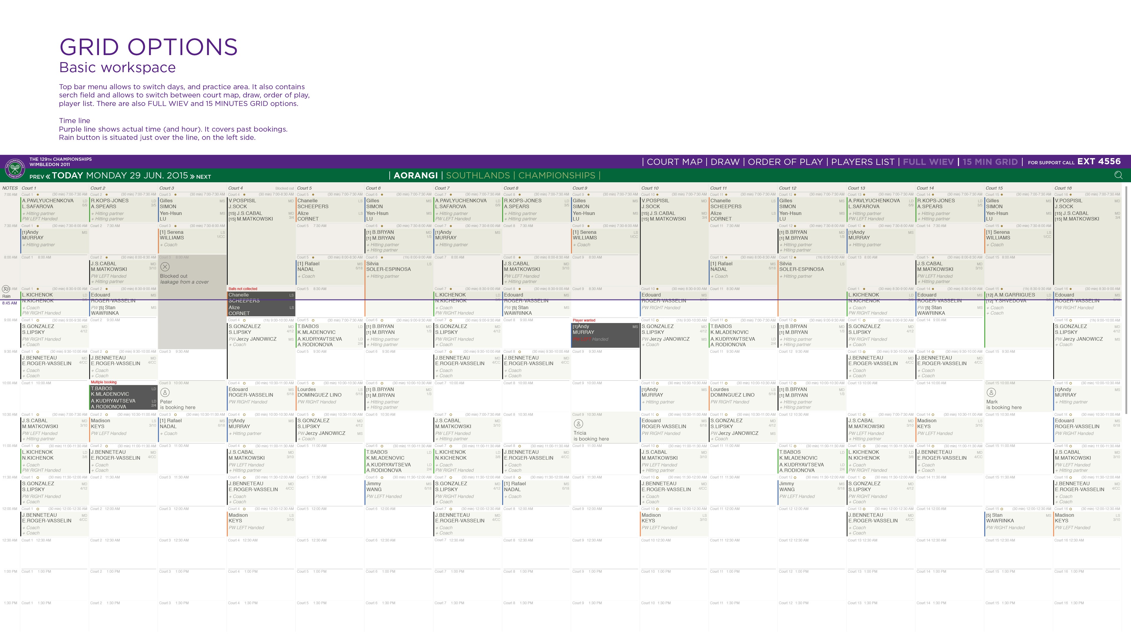
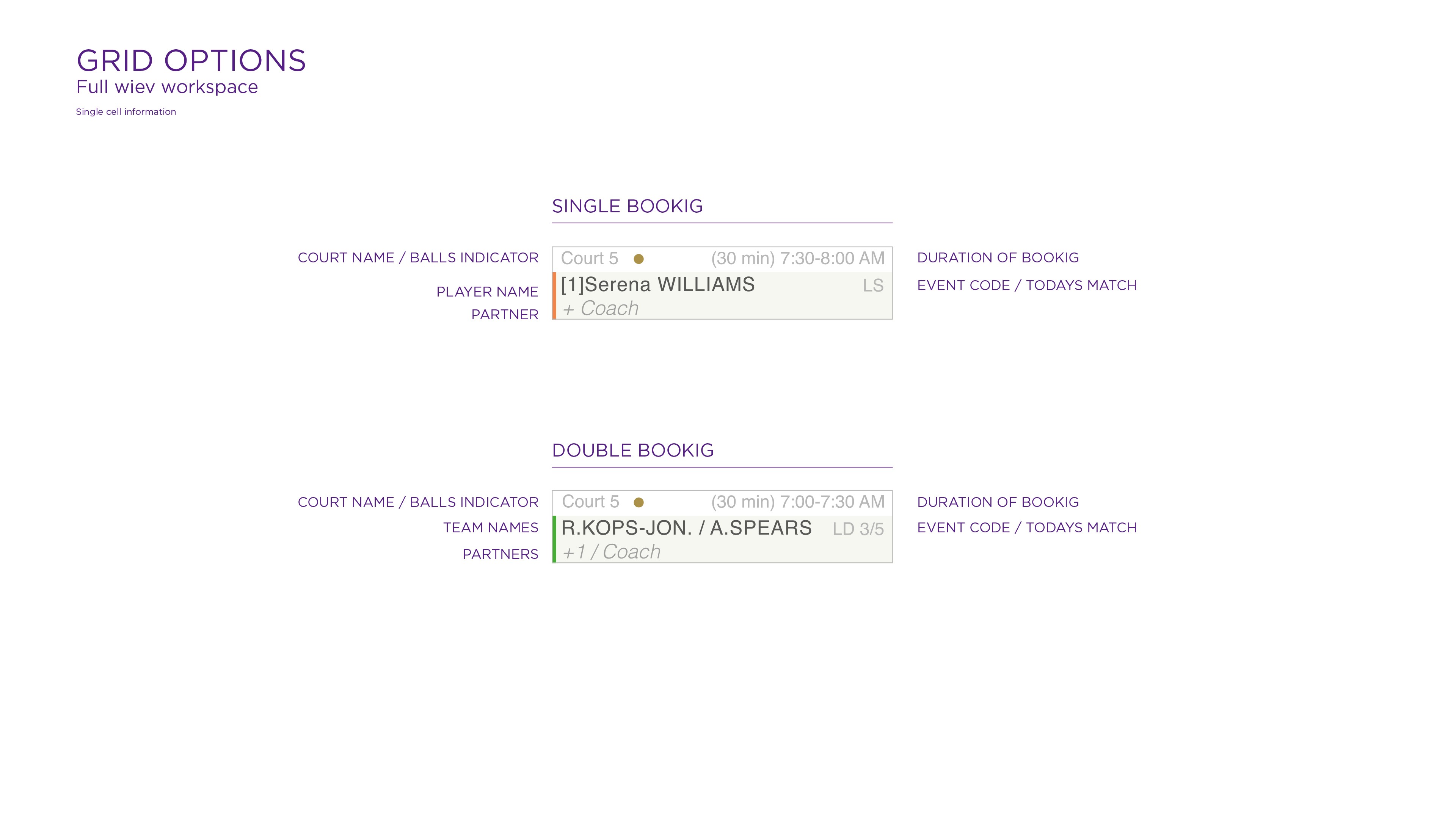
Grid View
- all courts displayed in a time-based layout
- visible names of players, training partners, and coaches
- color-coded markers (e.g. conflicts, placeholders, pending approvals)
- easy switching between days and time ranges
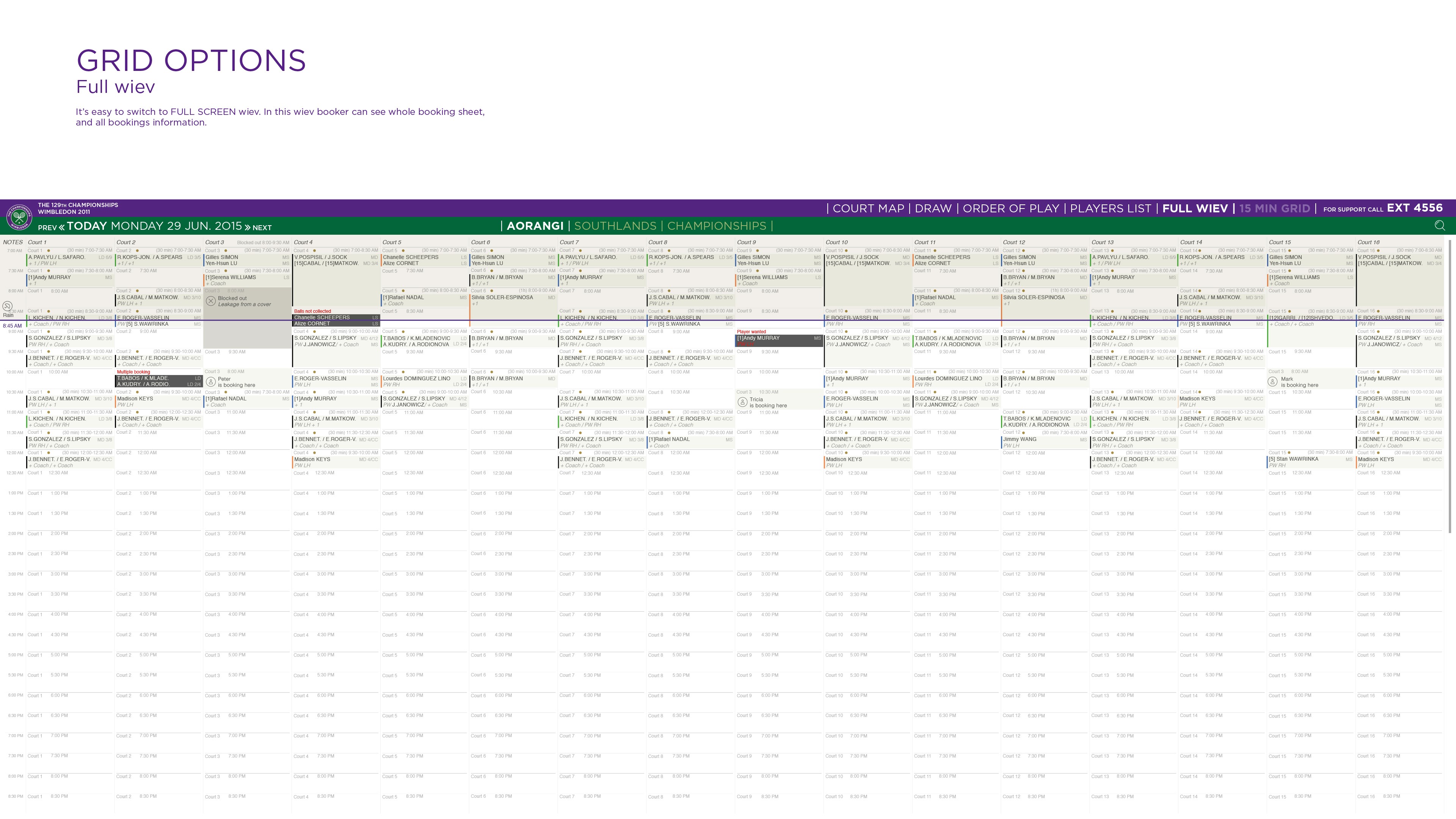
Full View
- full-screen mode for managing the entire schedule in real time
- bookings editable via drag and drop
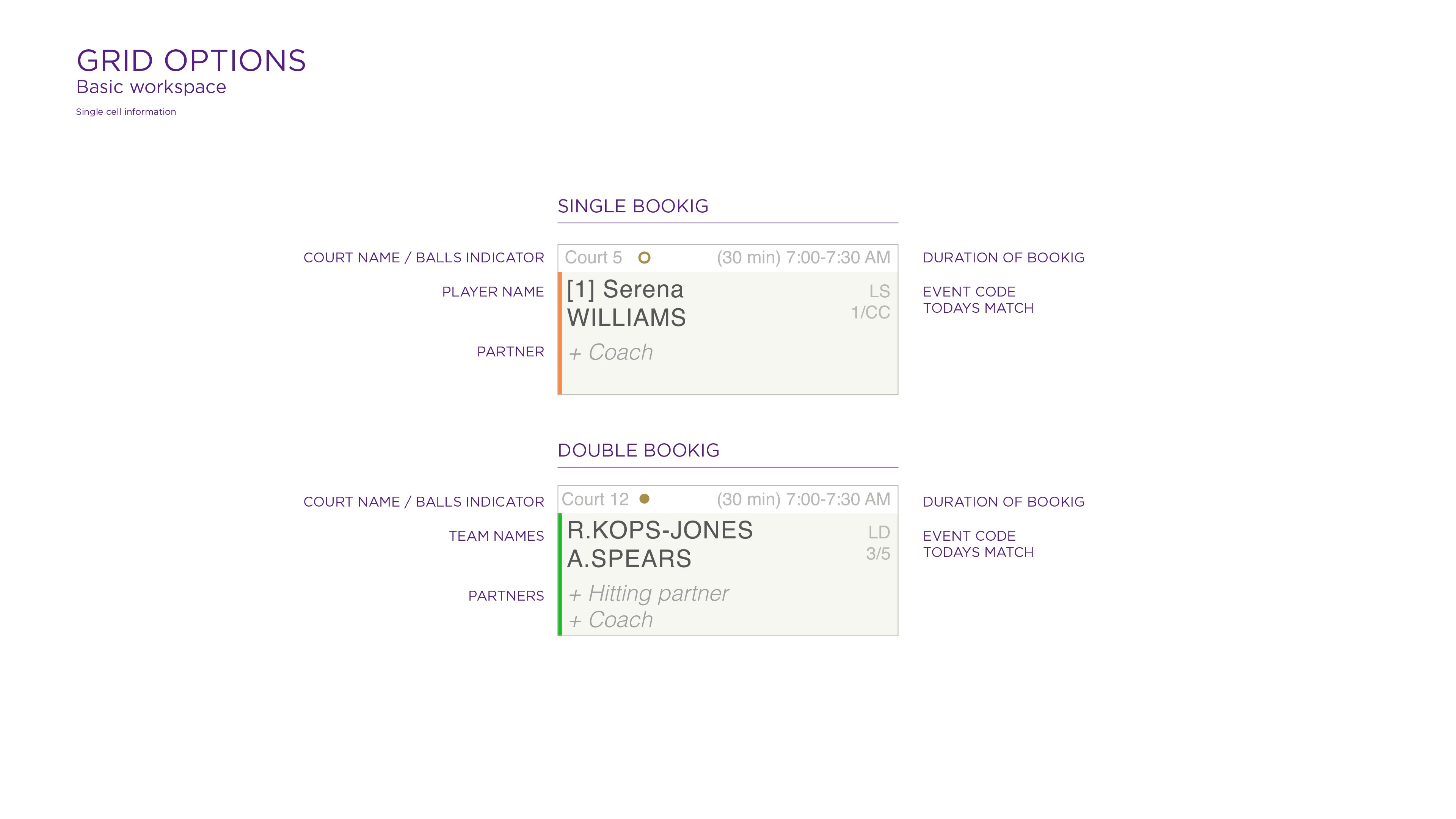
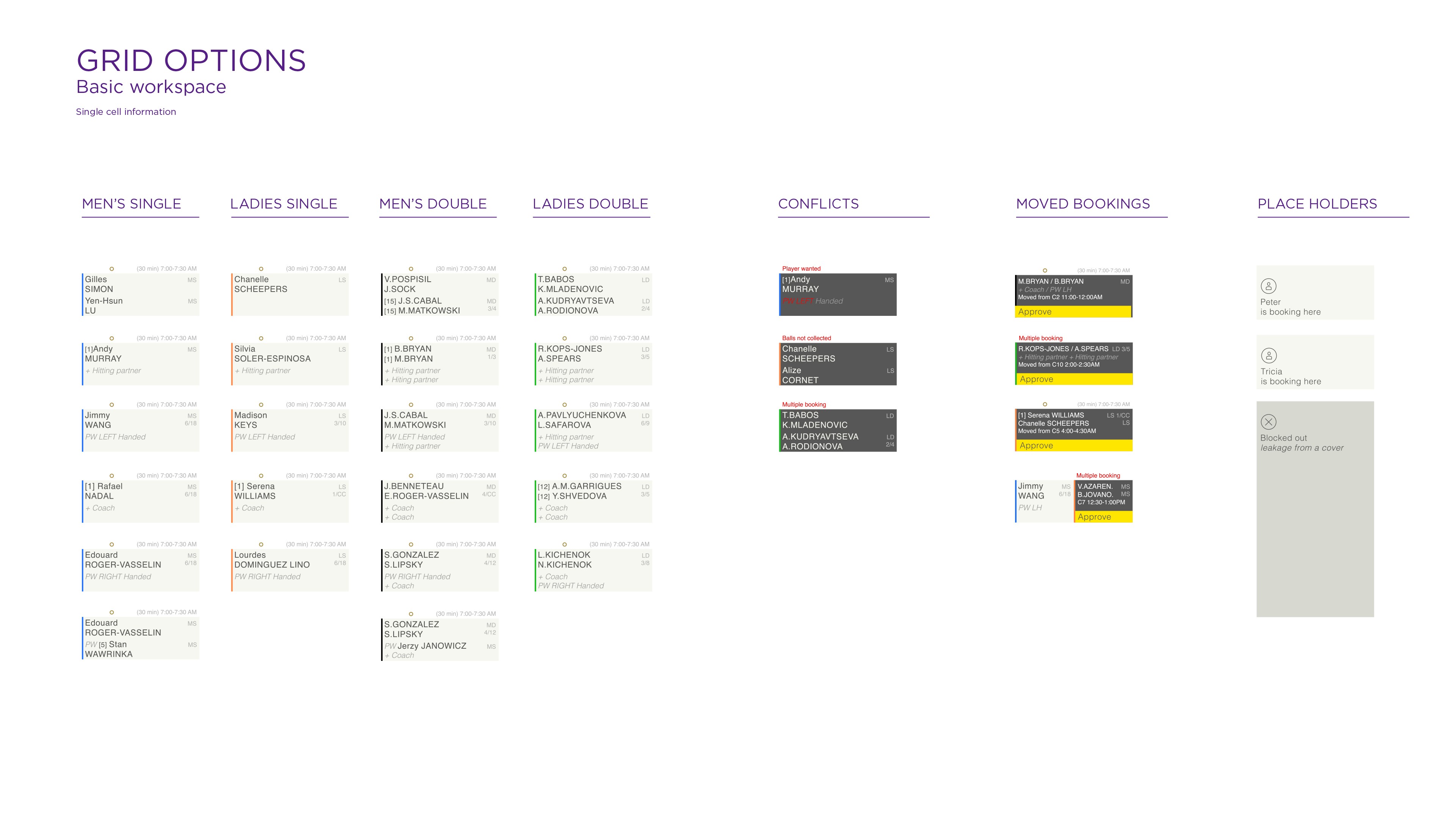
Single booking vs. double booking
- separate views for solo players and doubles teams
- clear distinction of partners, coaches, and hitting partners
Conflict and change management
- “player wanted” indicators
- approval system for changes (approve button)
- detection of available time slots
Adding new bookings
- detailed editor (partners, coach, contact, notes)
- quick save and publish options
Results
The implementation of the application brought tangible benefits to tournament organization, particularly in terms of speed and error reduction. Court booking staff were able to react to changes much faster, which directly improved the satisfaction of players and their coaches. The number of booking conflicts was reduced by as much as 50 percent, which is crucial in Grand Slam tournaments.
The new system significantly reduced organizational stress during critical stages of the event. As a result, staff could focus on coordinating the rest of the tournament instead of manually updating the schedule.
Key benefits
- 35% reduction in schedule management time
- 50% fewer booking conflicts
- simplified communication between court staff and coaches
- very positive feedback from staff (better visibility into booking statuses)
Takeaways
This project taught me that designing tools for sports events requires a high tolerance for change and a readiness for rapid iteration. Clear visual indicators turned out to be much more effective than long descriptions, improving readability and speeding up decision-making. Working in such a high-pressure environment required constant contact with users to avoid designing disconnected solutions. It was especially important to account for emergency scenarios such as last-minute match relocations. Users appreciated the full-screen mode, which improved comfort during peak hours. The new system improved not only planning but also communication between various stakeholder groups.
Today, I know that for similar projects, it is essential to include data validation and change history tracking mechanisms from the beginning to further minimize the risk of errors.
Lessons learned
- large sports events require transparency in planning
- rapid prototyping and edge-case testing were critical
- scalability matters — a tournament might have 5 courts, but also 20+
- simpler visual indicators worked better than descriptive messages
Wimbledon
Organizing a Grand Slam means solving big logistical puzzles. Hundreds of players and their teams share the same infrastructure, so the schedule has to be both precise and flexible.
Scope of Work
A thoughtful application design process
→ Research
Market analysis, problem identification, goal definition, forecasting, competition analysis, user surveys, persona creation, empathy mapping
→ UX Design
User journeys, information architecture, flow maps, functional wireframes
→ UI Design
Color palette, typography, brand style, interface components
→ Project Review
Key elements, aesthetics, functionality
→ Testing
A/B testing, high-fidelity prototypes, final conclusions
The Problem
Organizing tennis tournaments involves a high level of dynamism. Matches run long, weather disrupts plans, and players along with their teams make adjustments almost at the last minute. Existing scheduling tools have struggled to keep up with this pace. They were inflexible, slow, and hard to read. As a result, scheduling conflicts, court availability issues, communication breakdowns, and growing frustration among event participants became common.
A solution was needed that:
- provides a quick overview of court occupancy and the current schedule
- allows efficient response to changes and conflict management
- works both online and offline
- is flexible, intuitive, and easy to read for everyone involved in the planning process
My role
In this project, I served as the UX designer responsible for analyzing user needs, creating an intuitive information architecture, and designing interface prototypes. I worked closely with developers, the product owner, and tournament staff to ensure the solution met real-world needs. I moderated usability tests and gathered feedback from future users, which enabled iterative improvements to the product and adaptation to working under time pressure.
Key responsibilities
- user needs analysis (bookers, coaches, organizers)
- UX design of grids and detailed views
- interaction prototyping (drag and drop, approve booking)
- collaboration with the development team
- usability testing
Predictions:
- 50% fewer booking conflicts through automated detection
- 35% faster schedule management with digital systems
- 95% of coaches and players will expect instant booking visibility and communication
- 80% of systems will be scalable from small tournaments to Grand Slam events
- 70% of solutions will offer offline modes for network disruptions
- 85% of organizational decisions will be supported mainly by visual indicators (colors, grids)
Design process
I began the project with qualitative research among tournament staff to understand their challenges and daily tasks. We analyzed existing booking procedures and identified common problem areas, such as the unclear schedule. Based on these insights, I created wireframes which we tested in simulated conditions. This allowed us to quickly implement improvements grounded in real-life scenarios. The process included:
Research
- shadowing organizers in the tournament office
- analysis of use cases (e.g. quickly moving a player to another court)
- journey mapping for bookers and coaches
Prototyping
- hourly and daily grid views
- reservation type indicators (singles/doubles)
- prototypes of conflict and notification behaviors
Validation
- clickable prototype testing (Figma)
- emergency scenario simulations (last-minute player relocation)
- workshops with the umpire team
Solution
The final solution was based on a modular hourly grid view that enabled efficient real-time court management. The system allowed filtering bookings by game type and approval status, and made conflict detection easier through color-coded indicators. A full-screen mode improved comfort during peak scheduling times, while drag-and-drop functionality and notifications further supported effective schedule control.
Grid View
- all courts displayed in a time-based layout
- visible names of players, training partners, and coaches
- color-coded markers (e.g. conflicts, placeholders, pending approvals)
- easy switching between days and time ranges
Full View
- full-screen mode for managing the entire schedule in real time
- bookings editable via drag and drop
Single booking vs. double booking
- separate views for solo players and doubles teams
- clear distinction of partners, coaches, and hitting partners
Conflict and change management
- “player wanted” indicators
- approval system for changes (approve button)
- detection of available time slots
Adding new bookings
- detailed editor (partners, coach, contact, notes)
- quick save and publish options
Results
The implementation of the application brought tangible benefits to tournament organization, particularly in terms of speed and error reduction. Court booking staff were able to react to changes much faster, which directly improved the satisfaction of players and their coaches. The number of booking conflicts was reduced by as much as 50 percent, which is crucial in Grand Slam tournaments.
The new system significantly reduced organizational stress during critical stages of the event. As a result, staff could focus on coordinating the rest of the tournament instead of manually updating the schedule.
Key benefits
- 35% reduction in schedule management time
- 50% fewer booking conflicts
- simplified communication between court staff and coaches
- very positive feedback from staff (better visibility into booking statuses)
Takeaways
This project taught me that designing tools for sports events requires a high tolerance for change and a readiness for rapid iteration. Clear visual indicators turned out to be much more effective than long descriptions, improving readability and speeding up decision-making. Working in such a high-pressure environment required constant contact with users to avoid designing disconnected solutions. It was especially important to account for emergency scenarios such as last-minute match relocations. Users appreciated the full-screen mode, which improved comfort during peak hours. The new system improved not only planning but also communication between various stakeholder groups.
Today, I know that for similar projects, it is essential to include data validation and change history tracking mechanisms from the beginning to further minimize the risk of errors.
Lessons learned
- large sports events require transparency in planning
- rapid prototyping and edge-case testing were critical
- scalability matters — a tournament might have 5 courts, but also 20+
- simpler visual indicators worked better than descriptive messages