Toyota
Analysis and improvement recommendations for Toyota’s digital offer in terms of price transparency and GDPR consent. The proposed changes aim to simplify information delivery and accelerate purchasing decisions, while also reinforcing the brand’s modern image.
Scope of Work
A thoughtful application design process
↓ Research
Market analysis, problem identification, goal definition, forecasting, competition analysis, user surveys, persona creation, empathy mapping
↓ UX Design
User journeys, information architecture, flow maps, functional wireframes
↓ UI Design
Color palette, typography, brand style, interface components
↓ Project Review
Key elements, aesthetics, functionality
↓ Testing
A/B testing, high-fidelity prototypes, final conclusions
Problem
Toyota’s digital offer, though formally complete, was difficult for customers to understand quickly. Key information, such as the final price, was poorly emphasized, and the structure of pricing and GDPR consents lacked clarity. This led to delays in purchase decisions, follow-up questions, and a lack of trust in the content of the offer.
The need
It was necessary to simplify how information was presented in the offer, improve its clarity, and make it easier for customers to understand the key data: price, configuration scope, and data processing consents. The goal was to accelerate decision-making and strengthen the brand’s modern and transparent image.
My role
I acted as the designer responsible for analyzing the current offer documents and creating new, more user-friendly UX solutions. I developed recommendations and prototypes that simplified information delivery, reduced cognitive effort, and improved online sales efficiency.
Business context
Within Toyota’s digital customer service in the automotive sector, a CMS system was used to generate personalized offers for both fleet and individual clients. The end customer received a digital offer document containing:
- Offer preview (general info)
- Price details (breakdown of components and discounts)
- GDPR consents with legal disclosures
This enabled the sales process to be fully conducted online, without the need for an in-person visit to the dealership — especially relevant in the context of market changes (e.g. COVID-19 pandemic, increased interest in automotive e-commerce).
User goals
- Quickly understand the offer (how much do I pay and what do I get)
- Review details (vehicle configuration, surcharges)
- Assess whether the offer is competitive
- Ensure their personal data is handled lawfully and securely
- Easily accept the terms and proceed to contract signing
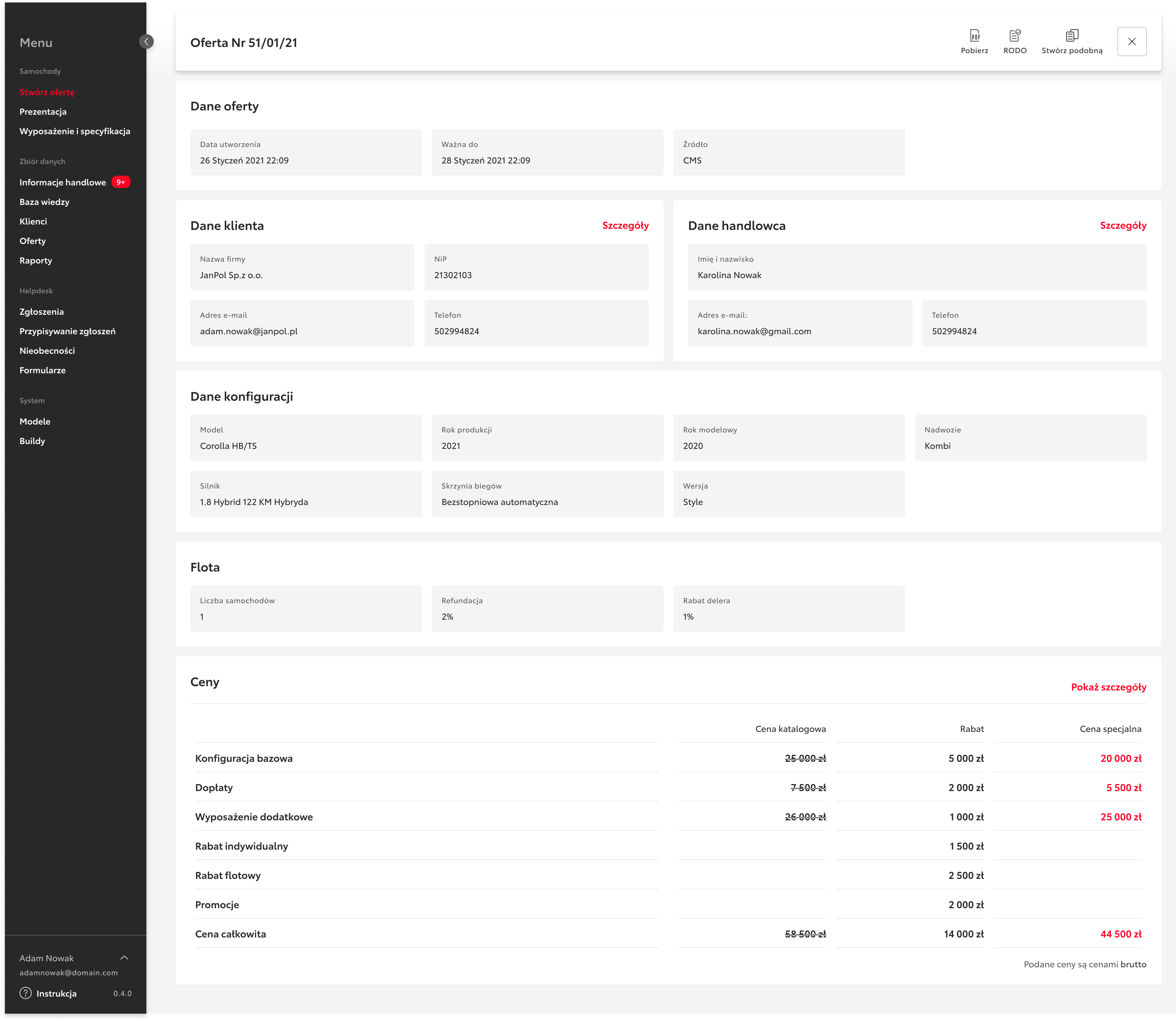
Offer preview
Strengths:
✓ Clear contact details for customer and salesperson
✓ Visible vehicle configuration (model, version, engine, transmission)
✓ Displayed list price and discounts
Challenges:
✗ Final price was not visually highlighted, buried in a table
✗ Too many numerical values in one section made it hard to assess the total cost
✗ Customer and salesperson info took up too much space, despite being rarely needed
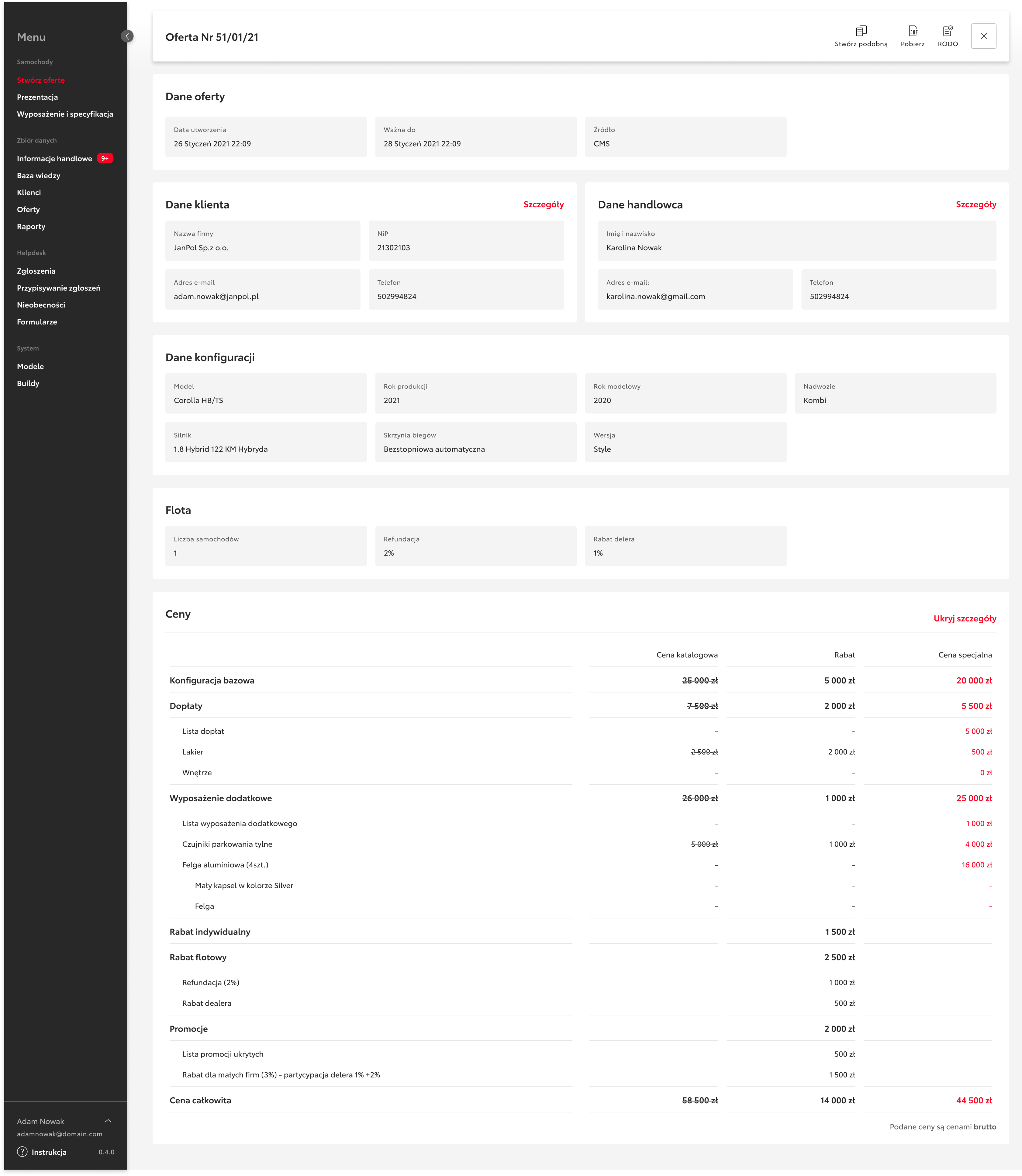
Price details
Strengths:
✓ Clear breakdown of discounts, surcharges, and promotions
✓ Visible base price structure
Challenges:
✗ Discounts and surcharges were hard to read (partially hidden or expanded); zero values mixed with real ones
✗ No visual hierarchy — all values looked the same, making it hard to see what mattered most
✗ Some terms lacked clarification (e.g. what does “fleet refund” mean?)
✗ The large table could discourage users from reading it entirely
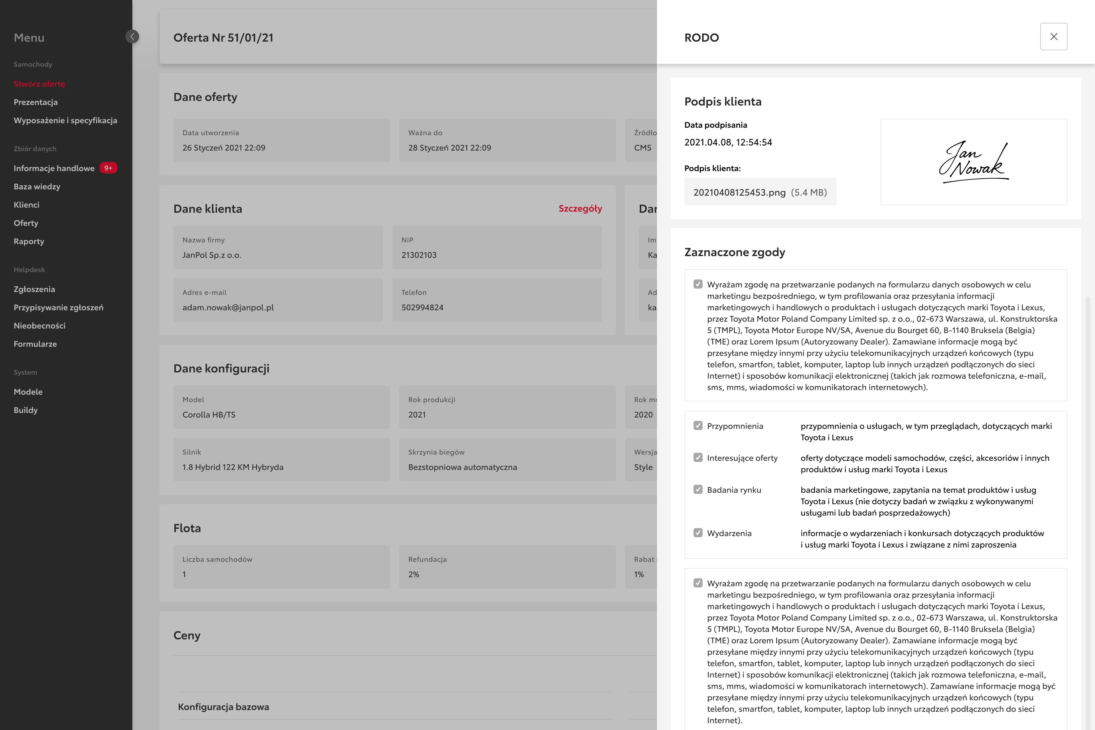
GDPR and consent section
Strengths:
✓ GDPR information obligation was fulfilled
✓ Clear list of consents with checkboxes
Challenges:
✗ Very long block of legal text
✗ No headings or bold elements — users could easily get lost
✗ Repetitive phrases increased cognitive load
✗ No clear summary of what the user was actually agreeing to
UX recommendations
Offer preview
- Move the final price to the top, using a larger font and brand color
- Present a bullet-point summary of included equipment
- Display customer and salesperson data in a collapsible section (accordion)
- Add a highlighted call-to-action: “Accept the offer”
Price Details
Introduce a graphical price breakdown diagram (e.g. bar chart) to visually represent the structure of the total price
Group discounts into logical categories:
• Fleet discounts
• Dealer discounts
• Promotions
• Surcharges
- Add icons for surcharge items (e.g. paint, rims) to support quick visual scanning
- Display the total discount amount more prominently to emphasize savings
- Enable easy toggling between net and gross price views for different user needs
GDPR Section
Use clear headings to structure content:
• Your consents
• Scope of data processing
• Your rights
- Display a brief summary of key consents (e.g. the 4 most important checkboxes) as a checklist
- Move the full legal text to a downloadable PDF link, reducing visual clutter
- Consider adding an infographic showing who processes the data (e.g. Toyota, dealer)
- In the Information obligation section, replace dense text with a bullet-point list to improve readability
User benefits
✓ Quick understanding of the offer (fewer questions, faster purchasing decisions)
✓ Greater sense of security regarding data processing
✓ Reduced cognitive effort when analyzing tables and legal texts
Business benefits
✓ Shorter sales cycle (customers don’t need clarification)
✓ Lower risk of offer rejection due to price confusion
✓ Builds trust in the brand through transparent communication about personal data
✓ Improves the dealer’s image as modern and customer-centric
Implementation roadmap
Stage 1 (2–3 weeks)
- Analysis of current offer wireframes
- Design of information hierarchy concept
- Creation of clickable prototypes
Stage 2 (4–6 weeks)
- User testing (5–7 participants)
- Iterative refinements based on feedback
- Preparation of the new document template
Stage 3 (6–8 weeks)
- CMS implementation
- Sales team training
- KPI monitoring (e.g. average customer decision time, number of offer-related inquiries)
Summary
The offer redesign for Toyota’s fleet and individual clients demonstrates that a digital document can be both formally complete and user-friendly — provided the structure of information and legal communication is well designed. By implementing the recommended changes, the project delivered measurable benefits for both the customer and the business, enhancing the effectiveness of online sales.
Outcomes
- Improved clarity of the digital offer: customers better understood what they would pay and what they would receive
- Shortened sales cycle: fewer inquiries, quicker decisions
- Increased trust in the offer and brand through clearer GDPR communication
- Reduced cognitive friction when reviewing complex tables and legal content
- Post-implementation tracking of KPIs such as customer decision time and number of inquiries helped measure impact
Conclusions
- Even a formally correct document can hinder sales if it doesn’t support users cognitively
- Key information (like the final price) must be visually emphasized — not just available
- Transparency and simplicity directly drive trust and conversion
- Small adjustments to information structure (headings, icons, bullet points) can yield disproportionately large results
Lessons learned
- Offer documents should be designed like interfaces — with user journeys and cognitive limits in mind
- Good UX is not just about visuals — it’s about how information is organized, communicated, and worded
- Iterative prototyping and user testing are crucial even for documents, not just digital products
- Involving and educating the sales team improves the success of the rollout and adoption
Toyota
Analysis and improvement recommendations for Toyota’s digital offer in terms of price transparency and GDPR consent. The proposed changes aim to simplify information delivery and accelerate purchasing decisions, while also reinforcing the brand’s modern image.
Scope of Work
A thoughtful application design process
→ Research
Market analysis, problem identification, goal definition, forecasting, competition analysis, user surveys, persona creation, empathy mapping
→ UX Design
User journeys, information architecture, flow maps, functional wireframes
→ UI Design
Color palette, typography, brand style, interface components
→ Project Review
Key elements, aesthetics, functionality
→ Testing
A/B testing, high-fidelity prototypes, final conclusions
Problem
Toyota’s digital offer, though formally complete, was difficult for customers to understand quickly. Key information, such as the final price, was poorly emphasized, and the structure of pricing and GDPR consents lacked clarity. This led to delays in purchase decisions, follow-up questions, and a lack of trust in the content of the offer.
The need
It was necessary to simplify how information was presented in the offer, improve its clarity, and make it easier for customers to understand the key data: price, configuration scope, and data processing consents. The goal was to accelerate decision-making and strengthen the brand’s modern and transparent image.
My role
I acted as the designer responsible for analyzing the current offer documents and creating new, more user-friendly UX solutions. I developed recommendations and prototypes that simplified information delivery, reduced cognitive effort, and improved online sales efficiency.
Business context
Within Toyota’s digital customer service in the automotive sector, a CMS system was used to generate personalized offers for both fleet and individual clients. The end customer received a digital offer document containing:
- Offer preview (general info)
- Price details (breakdown of components and discounts)
- GDPR consents with legal disclosures
This enabled the sales process to be fully conducted online, without the need for an in-person visit to the dealership — especially relevant in the context of market changes (e.g. COVID-19 pandemic, increased interest in automotive e-commerce).
User goals
- Quickly understand the offer (how much do I pay and what do I get)
- Review details (vehicle configuration, surcharges)
- Assess whether the offer is competitive
- Ensure their personal data is handled lawfully and securely
- Easily accept the terms and proceed to contract signing
Offer preview
Strengths:
✓ Clear contact details for customer and salesperson
✓ Visible vehicle configuration (model, version, engine, transmission)
✓ Displayed list price and discounts
Challenges:
✗ Final price was not visually highlighted, buried in a table
✗ Too many numerical values in one section made it hard to assess the total cost
✗ Customer and salesperson info took up too much space, despite being rarely needed
Price details
Strengths:
✓ Clear breakdown of discounts, surcharges, and promotions
✓ Visible base price structure
Challenges:
✗ Discounts and surcharges were hard to read (partially hidden or expanded); zero values mixed with real ones
✗ No visual hierarchy — all values looked the same, making it hard to see what mattered most
✗ Some terms lacked clarification (e.g. what does “fleet refund” mean?)
✗ The large table could discourage users from reading it entirely
GDPR and consent section
Strengths:
✓ GDPR information obligation was fulfilled
✓ Clear list of consents with checkboxes
Challenges:
✗ Very long block of legal text
✗ No headings or bold elements — users could easily get lost
✗ Repetitive phrases increased cognitive load
✗ No clear summary of what the user was actually agreeing to
UX recommendations
Offer preview
- Move the final price to the top, using a larger font and brand color
- Present a bullet-point summary of included equipment
- Display customer and salesperson data in a collapsible section (accordion)
- Add a highlighted call-to-action: “Accept the offer”
Price Details
Introduce a graphical price breakdown diagram (e.g. bar chart) to visually represent the structure of the total price
Group discounts into logical categories:
• Fleet discounts
• Dealer discounts
• Promotions
• Surcharges
- Add icons for surcharge items (e.g. paint, rims) to support quick visual scanning
- Display the total discount amount more prominently to emphasize savings
- Enable easy toggling between net and gross price views for different user needs
GDPR Section
Use clear headings to structure content:
• Your consents
• Scope of data processing
• Your rights
- Display a brief summary of key consents (e.g. the 4 most important checkboxes) as a checklist
- Move the full legal text to a downloadable PDF link, reducing visual clutter
- Consider adding an infographic showing who processes the data (e.g. Toyota, dealer)
- In the Information obligation section, replace dense text with a bullet-point list to improve readability
User benefits
✓ Quick understanding of the offer (fewer questions, faster purchasing decisions)
✓ Greater sense of security regarding data processing
✓ Reduced cognitive effort when analyzing tables and legal texts
Business benefits
✓ Shorter sales cycle (customers don’t need clarification)
✓ Lower risk of offer rejection due to price confusion
✓ Builds trust in the brand through transparent communication about personal data
✓ Improves the dealer’s image as modern and customer-centric
Implementation roadmap
Stage 1 (2–3 weeks)
- Analysis of current offer wireframes
- Design of information hierarchy concept
- Creation of clickable prototypes
Stage 2 (4–6 weeks)
- User testing (5–7 participants)
- Iterative refinements based on feedback
- Preparation of the new document template
Stage 3 (6–8 weeks)
- CMS implementation
- Sales team training
- KPI monitoring (e.g. average customer decision time, number of offer-related inquiries)
Summary
The offer redesign for Toyota’s fleet and individual clients demonstrates that a digital document can be both formally complete and user-friendly — provided the structure of information and legal communication is well designed. By implementing the recommended changes, the project delivered measurable benefits for both the customer and the business, enhancing the effectiveness of online sales.
Outcomes
- Improved clarity of the digital offer: customers better understood what they would pay and what they would receive
- Shortened sales cycle: fewer inquiries, quicker decisions
- Increased trust in the offer and brand through clearer GDPR communication
- Reduced cognitive friction when reviewing complex tables and legal content
- Post-implementation tracking of KPIs such as customer decision time and number of inquiries helped measure impact
Conclusions
- Even a formally correct document can hinder sales if it doesn’t support users cognitively
- Key information (like the final price) must be visually emphasized — not just available
- Transparency and simplicity directly drive trust and conversion
- Small adjustments to information structure (headings, icons, bullet points) can yield disproportionately large results
Lessons learned
- Offer documents should be designed like interfaces — with user journeys and cognitive limits in mind
- Good UX is not just about visuals — it’s about how information is organized, communicated, and worded
- Iterative prototyping and user testing are crucial even for documents, not just digital products
- Involving and educating the sales team improves the success of the rollout and adoption